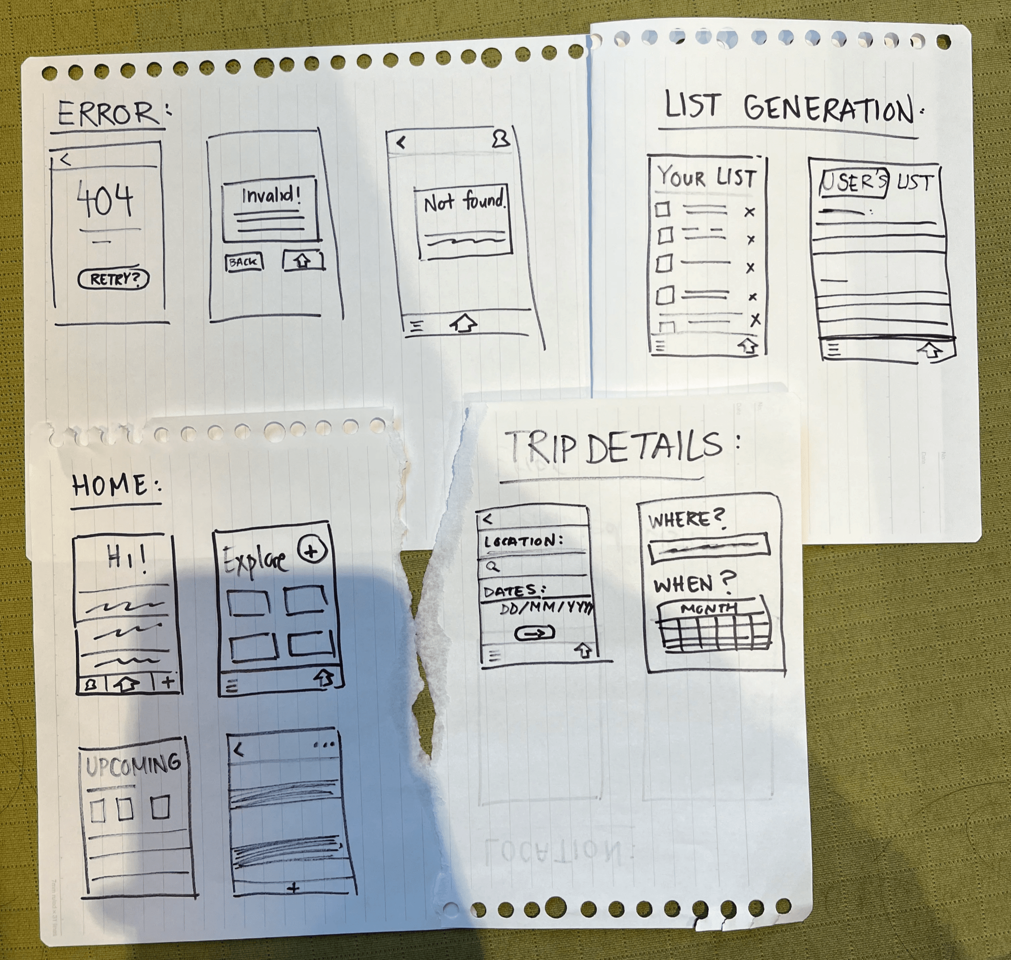

"Help naive travelers pack for unexpected region-specific factors to alleviate stressors of an unknown destination."
Help travelers pack clothing ———→ clothing seemed to narrow and uninspired
All-in-one travel app ———→ this was much too ambitious and relied too much on A.I.
Culturally focused packing app ———→ unique twist of location specific suggestions

After collectively pooling our user interview transcripts together through the above affinity diagram, we “coded” [labelling verbal data into categories] each snippet of information from our transcripts. This was then distilled to several pain points.
We found that of the four most important insights, lifestyle adaptation was the most overlooked by competitors and the most anxiety-inducing by our research participants. This resulted in our main opportunity or gap in the market to focus on cultural differentiation for packing.


Individually, after completing the mood board, each team member created a “style tile” to capture the essence of our mood board. The goal was to combine the feelings of both our vision words and relaxation when packing to our users through the following design(s):

The chosen blue and yellow branding colours for our app may have deviated slightly from the original mood board, however this was done as a byproduct of feedback in user testing to avoid being precieved as a meditation app.


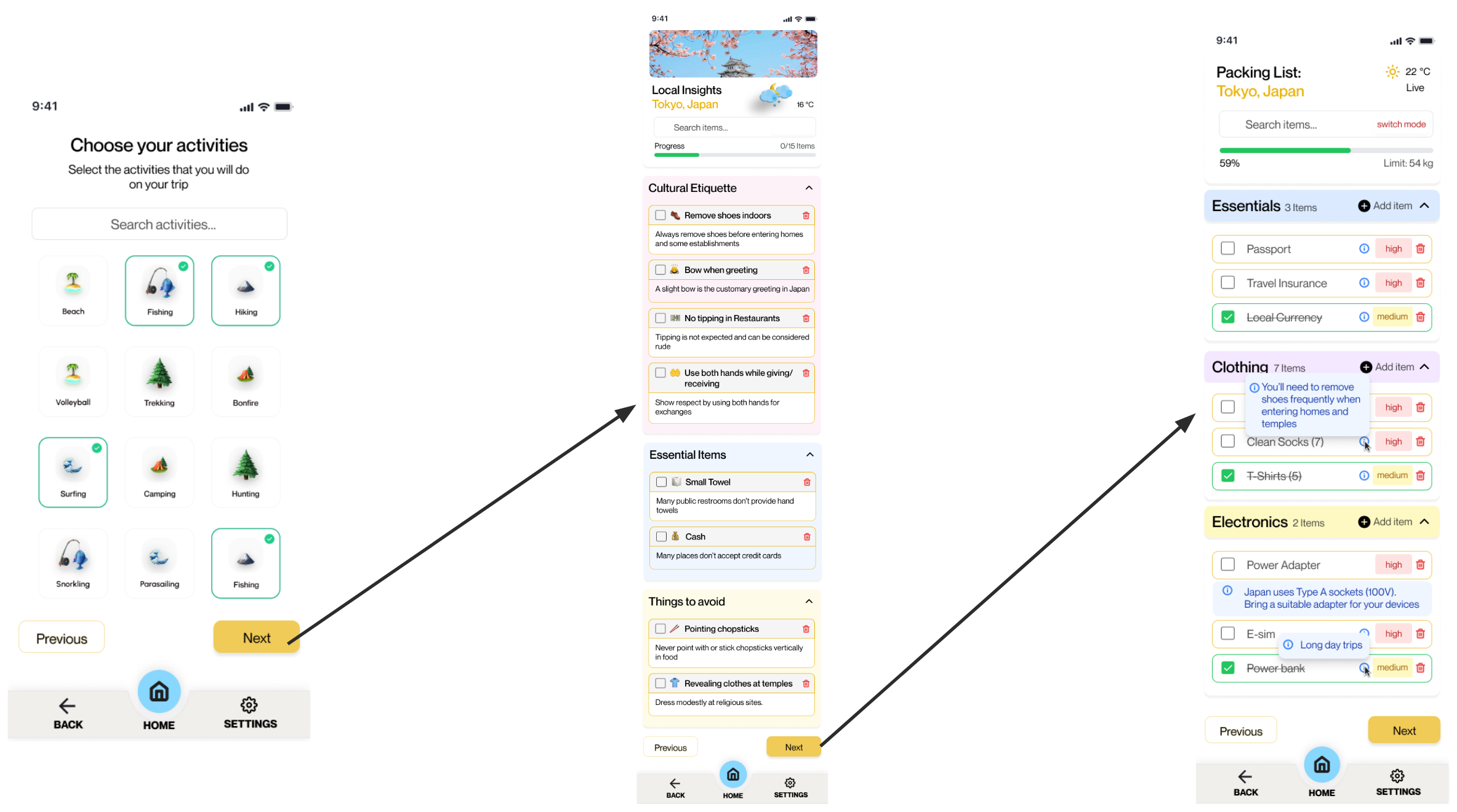
Either upload a plane ticket, or manually enter dates, number of travellers, and luggage weights
Highlight activities that are currently planned to be attended on the trip, to guide the user on proper attire and equipment if necessary
Shows the user an overview of culturally appropriate etiquettes and items needed based on various other factors (e.g. weather, legality)
User is given a generated list of items to pack, cross out, and view reasoning for through a drop-down menu for each category (e.g. Clothing)


Playback 1 (Week 4):
Too much text on the slides
Some considerations for users were missed (e.g. uncontrollable factors like weather)
Artificial Intelligence is tricky and a “catch-all” solution, therefore not recommended
Playback 2 (Week 8): PRESENTED BY REA
Integrate multiple stops/destinations into one list
Add activities the user is planning on attending during the trip
Gather feedback from peers/users on clarity when user testing [in the following weeks]
Playback 3 (Week 12):
Condensed slides were clear and readable
Storytelling needs to be stronger near the start of the presentation
Colours are too distracting and need to be toned down
Concerns with accessibility, lacking contrast throughout